Saturday 16 March 2013

Strengths and Weaknesses

When I decided to blog about my strengths and weaknesses, I had to stop and really think. It was easy to come up with weaknesses, but what were my strengths? In my program, I often feel like I have none. But when I thought about the kind of stuff I did before coming to Conestoga, when I was working with all the time in the world, it was easy to figure out my strengths.

I've been drawing since I was little. I've always loved it, but I gave it up for a long time because I could never make things look as real as I wanted them to. It wasn't until halfway through highschool that I learned important skills, started to practice more, and was able to fulfill the expectations that I had for myself. So, while I don't use my drawing skills often, I still have them and I'm able to use them every so often. Here are some examples that I used in my portfolio:
Images are the property of Caitlin McElroy


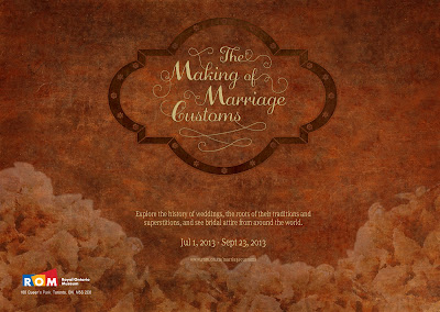
Then there are page layouts. Posters, ads, anything full of type and other visual elements. I don't know what it is...I just can't seem to get the hang of doing them well. If it's a photography based ad with just a product name and slogan, that's fine, but as soon as you add more, it turns into a mess. The following is a poster advertising a museum exhibit that I created. It's awful, but a hundred times better than the original (this is a redo I did for my final evaluation last semester.)


The exhibit was called The Making of Marriage Customs, and explored the history of weddings, the roots of their traditions and superstitions, and showcased bridal attire from around the world. While laying out posters isn't something I'm very good at, my problem with this particular project arose from my trying to mimic the look of my museum catalogue on a larger scale. For a historic feel, my catalogue mimicked gold embossed leather, which worked well for a book cover, but didn't translate well for other uses.

Hopefully, in time and with a lot of practice, I'll be able to start meeting some of my poster making expectations, like I did with my illustration skills.

Thursday 14 March 2013

Castle Kilbride

Image is the property of Caitlin McElroy
There are a lot of architectural marvels in the region of Waterloo, old and new, but one that I have visited recently and really enjoyed is Castle Kilbride in Baden. www.castlekilbride.ca

This Italianate style house was built in 1877 by James Livingston and named after his birthplace in Scotland. While being a beautifully built house and meticulously restored, it's inside - particularly the walls and ceilings - is of even greater interest. 

Much of the interior is decorated in a trompe l'oeil style, which is an illusionist style that gives flat, two-dimensional art the appearance of being three-dimensional. Here are some examples:

Left: An artist restores some of the ceiling work.
Right: Everything in the image, including the "plaster work" is just paint on a flat surface!


My only complaint about the visit is the fact that you enter from the back of the house, which is where a large modern addition for museum staff and meeting rooms is located. So, rather than entering through the front door and experiencing the front foyer - which has the most impressive work - the way it was intended, you enter through the back door...like the servants would have.

Sunday 10 March 2013

Jane Austen Game - Character Illustrations

Illustrated Jane Austen Characters by Florence Minowa
http://www.behance.net/gallery/Jane-Austen-Game-Character-Illustrations/4930789

When I came across Florence Minowa's illustrated Jane Austen characters, I was immediately in love. Her illustrations are beautiful and capture the personalities of each character perfectly. Darcy as a calm, regal and sophisticated man. Elizabeth as an energetic and lively woman, and her sister Jane, as a demure beauty. See them all here!

I'm a huge Jane Austen fan, and would love to design anything related to it. Combining my love of literature and my skills as a designer would be the ultimate career dream come true!

Friday 8 March 2013

Modern Classic Paintings

Painting by Mark Demsteader
http://demsteader.com/


As I've made clear in a previous posting (An Afternoon at MoMA), modern art is not something I like, but I've recently discovered an artist whose combination of Classic and Modern styles creates something really unique; Mark Demsteader, a British contemporary figurative artist. Demsteader.com I love his work! The beauty of his subjects is evident, but by combining his realistic style with rough, strategically messy clothing and a slightly blurred haloing of the skin, he creates something ethereal and haunting. So, while modern art on it's own is just a waste, aspects of it are useful for enhancing what I would refer to as "true art."

Thursday 7 March 2013

Portrait Photography

Images are the property of Caitlin McElroy
Portrait photography is something that I only do for school, so when I was asked to blog about a successful portrait that I've taken, I didn't have many options. This is a series of photos that I took during my first year photography course for a single light source project. These pictures were taken next to a window, and a reflector was used to help bounce light onto the left side of her face.

I'd say that these are successful photos because my subject is well-lit, she's animated, and her face is in-focus. Other parts of her are admittedly not as in-focus as they should be, and some of the colours are a little off, but for a first year photography project from someone who has never done portrait photography, they turned out pretty well!

Saturday 2 March 2013

2013 Colour of the Year

Images from www.pantone.com
I'm not the kind of person who keeps track of trends - which is shameful for a graphic design student, I know - but after watching some of my peers procrastinate by creating cascading Pantone rainbows with their Pantone books, I decided to see what the Pantone colour of the year was. I'd heard that it was a green colour, but I didn't know the specifics. So, a full 2 months late, the 2013 colour of the year is Pantone 17-5641 Emerald! Learn more about their choice here.

Past colours of the year include:

Thursday 28 February 2013

Confessions


All images from candychang.com/confessions/

Once again, StumbleUpon has led me to a fascinating discovery. Over the summer of 2012, the artist, designer and urban planner Candy Chang created a public art project that "invites people to anonymously share their confessions and see the confessions of the people around them in the heart of the Las Vegas strip." Check it out! http://candychang.com/confessions/

I absolutely love this idea. Everyone has secrets. Everyone. Secrets to hide, confess, laugh about or regret. Secrets that no one knows because of our fear of embarrassment, rejection, scorn, or punishment. Secrets that only complete and utter anonymity can pry from our hearts. It is amazing how such a simple thing can completely break down the walls inside us.

The result is absolutely spectacular. It's real, raw and a little heartbreaking. When you read these cards, the uncensored truth and vulnerability of so many of the authors...it's the epitome of humanity. Each card, whether it's silly or serious, has a story behind it and a wealth of emotions connected to it. Each card could represent years, if not a full life-time of joy, love, regret, fear, disappointment, or passion. So many artists strive for honesty in their work. This is as honest and real as any art piece of art can get.


Sunday 24 February 2013

Psychedelic Animal Specimens

Image from: io9.com
Like my last blog post, I've found work that combines science and art in a creative and beautiful way. The Japanese artist Iori Tomita "combines classical specimen preservation techniques with meticulous staining methods [to] transform fish, squid, turtles and even chameleons into a menagerie of multi-colored hell beasts." http://io9.com/5929143/these-psychedelic-animal-specimens-are-unlike-anything-youve-ever-seen

These multi-coloured, transparent animals are beautiful and disturbing at the same time. What I'd like to know is how anyone comes up with the idea to do this. I guess if you know about biology and preservation techniques, you'd get inspired, but it's still a strange thing to decide to do. I'd also like to know where these animals are coming from. Have they been killed for the sole purpose of being art, or did they die naturally?

This is a great example of how art carries across disciplines. I find it encouraging as well because it gives me hope that I might be able to incorporate some of my other interests into what I'm doing.

Friday 22 February 2013

Anamorphic Sculptures

Image from: http://www.ignant.de/2013/01/30/anamorphic-sculptures/
Besides loving sculptures from the Classical period, sculpture is a topic that I know very little about. So, I was intrigued when I learned about anamorphic sculptures. I've never heard of that before tonight. Here's the site I stumbled upon: http://www.ignant.de/2013/01/30/anamorphic-sculptures/ The sculpture is revealed in a reflective cylinder, rather than being distorted by it. It's a very interesting mix of art and science.

Sunday 17 February 2013

JOCO Cups

Images from jococups.com
It's amazing how many cool things I find while doing research for projects...even though 98% of the time they have no connection to what I was looking for in the first place. I found a company located in Australia, called JOCO, which sells reusable (and stylish) glass coffee cups. Their tagline is Cups that Care! Clear Cups with a Clear Conscience. I just love that. I don't buy hot drinks often, I'm a brew-your-own kind of person, but I would definitely buy one of these all the same. I also love their packaging. The stylish cups come in a stylish cylindrical box that is reusable. I'll have to see if there are any Canadian retailers selling these.


Friday 15 February 2013

Print vs. E-Waste

E-Waste is a relatively new term to me, not because I'm not familiar with electronic waste, but because it's a topic that is rarely talked about, and because I've never heard it be referred to in its short-form. You often hear the discussion about how wasteful printed materials are, and how outmoded they are becoming, but you never hear about how wasteful the world of electronics is, which is very surprising because of how many electronic devices are available now. Print and electronics both have their uses and benefits, as well as their drawbacks, but is one really any better than the other?

I did some research and came across a website treehugger.com which has a really neat infographic about e-waste that summarizes what I've read on other websites, but with pictures. Check it out here. They also have multiple articles about the ongoing debate between books and e-readers. See one of them here, which discusses whether e-books are really more "green" than their printed counterparts.

Here are summaries of what I've found and some of my thoughts on the issue:
  • Electronics and printed materials both have negative impacts on the environment. 
  • There should be a balance between the two. We need to cutback on unnecessary paper uses, either by getting rid of them altogether, or by moving things into the electronic age. I'm thinking specifically of mail flyers, bank statements and manuals for electronics.
  • Paper use is not going anywhere, so we should start exploring the mass production of more sustainable types of paper, like bamboo paper, sugarcane paper and rock paper, and make a greater effort to only purchase paper that is FSC-certified (Forest Stewardship Council)
  • We shouldn't be condemning the use of paper because it has many benefits that electronics will never be able to match or replace:
    • A lot of paper can be made with the use of 100% recycled materials.
    • Paper is a lot easier to recycle, both in terms of the consumer getting rid of it, and the actual recycling process.
    • Paper can be composted and breaks down naturally - depending on the amount of ink and what kind of inks were used on it.
    • Paper is more easily reused.
    • Paper lasts far longer than any electronic ever will. Human's have been writing things down since the beginning of time, and we will always need to have hard copies of records and important documents.
  • Electronics are very useful and should be used more often to help streamline businesses, but there is, again, the need for hard copies.
  • Electronics have VERY short life spans and are replaced on a regular basis. Think of the number of cell phones, music players, tablets, and TV's, just to name a few, the average person is likely to go through in a lifetime.
  • Many electronics contain toxic materials and valuable resources that wind up in landfills.
Print and electronics are both important parts of our lives, and both have a right to be there, but since they both have different uses and benefits, we need to learn how to use both to their best abilities and figure out what would be best for any given circumstance. But regardless of whether you lean toward one of the other, both can be incredibly wasteful, and we need to start taking more responsibility for the resources that we consume.

Saturday 9 February 2013

The Art of Cleanup

Created by Ursus Wehrli.
Photos from http://www.jeanniejeannie.com/2011/08/29/the-art-of-clean-up-sorting-and-stacking-everyday-objects/
StumbleUpon has once again helped me find something neat to blog about. The Art of Cleanup is a series of photographs by Swiss artist and comedian Ursus Wehrli for an upcoming book. There is a whole series of these organizational photos on the website I listed under the images. They are amazing, and I can imagine would be appreciated by anyone with an obsessive compulsive need to keep things neat and organized. He "organizes" different food dishes, cars in a parking lot, people at a pool, and even famous paintings!

Monday 4 February 2013

School Work Overload

Today was not a good day, not only for me but for quite a few of my classmates as well. Weeks of non-stop work coupled with the short, cold winter days has rendered many of us tired, creatively drained and in desperate need of a break. It's true that we've only been back in school for a month now, but it has been an intense month. I really don't understand why we're given quite so much work. I know that in the professional world, if we end up at a design firm or go free-lance, that we'll be expected to juggle 8-9 projects at any given time, and will have to work odd hours, but that isn't the established norm, and even if it is for some companies, this whole workaholic lifestyle - never having free time or the ability to have hobbies or a social life isn't healthy for anyone, and really shouldn't be getting promoted, especially not by teachers.

I feel so drained right now, and can't afford to be. I have 8 major projects on the go. I do my best to time manage, but there just aren't enough hours in the day. I set deadlines for myself and work long hours - especially on weekends, and I still can't keep up. So many of the projects we're working on require a constant flow of creativity and detailed work that can't be rushed. I just don't get it. I like the projects we're working on, but there is just too much of them all at once in a never-ending stream.

It's at times like this that I begin to question my suitability, not only for the design industry, but for this program as well. Yet, if someone who works as hard as I do can't keep up with the coursework,  then surely there is something wrong with the way things are being handled. I understand that they're trying to prepare us for the work-world, but pushing people into creative blackouts and stress-induced fits of hysteria is not going to accomplish anything. The saying "quantity versus quality" exists for a reason. Yes, you need to find the delicate balance between the two, but that is going to be different for every individual, and I can tell you right now, I am not doing my best design work

Sunday 3 February 2013

Typographic Art

I recently discovered the letterer/illustrator Jessica Hische. Visit her site: jessicahische.is/awesome. I discovered her as I was looking for the designer of the cover of Pride and Prejudice, found a few posts below. A lot of her work is retro and whimsical, so it's the kind of stuff that I love. Here are some examples of her work:


Typography and poster/page design are not things I'm very good at, so I have a real respect for people who are able to produce such amazing designs with only letters.

Saturday 2 February 2013

Acrylic Painting Process

In illustration class we're working on illustrated books of poetry. I chose the poem Annabel Lee by Edgar Allan Poe, read it here, and I chose to use acrylic paint to tell the story. It's 12 spreads long, and I have documented my progress during the first one to show you how I approach projects like this one. (The images aren't great quality, but it will give you the idea.)

This is the text that will go in this spread:

It was many and many a year ago,
   In a kingdom by the sea,
That a maiden there lived whom you may know
   By the name of Annabel Lee;

After deciding on my size, 8" by 6" pages / 6" by 16" spreads, I cut my paper, making sure to leave an extra 1/4" on all sides for a bleed so that when I scan the images in and crop them, I can be sure that there is paint all the way to the edges.

Then comes the paint!

Step 1

I paint a base coat in solid colours. This will be a seaside panel so I roughed out where the sky, water and hillside will go.


Step 2

I add lighter green paint to the hills in the foreground, this time using different shades to mimic grass and give it depth.


Step 3

I add several shades of blue to the sky, paint clouds and add texture to the hillside to show the ridges and where the sunlight will hit the various valleys. I even add some smaller landmasses emerging from the water along the coast.

Step 4

I paint the water a darker blue and add waves that become more apparent closer to shore.


Step 5

Now that the landscape is done, it's time to add in the extra bits. This is going to be "the kingdom by the sea." So, I paint a light, rough base coat of where I want it to go.


Step 6

Then I add rough outlines with grey paint so I know what's going to be what in this beige mass of buildings.


Step 7

The buildings, walls and towers get filled in. I added shading in areas to give it more dimension.


Step 8

I make some minor adjustments to correct things (the biggest tower was a bit crooked), then add trees and other foliage to help it blend into the surroundings more.


Step 9

Now for the two children. I add another light base coat where I want them. You can see where I had originally placed them...more to the right, but I realized it was too close to the edge of the page. That's the nice thing about acrylic, it's easy to fix mistakes.


Step 10

I add basic colours to the kids and finalize how their bodies are positioned.


Step 11

More detail is added, like shading to their clothes, hair and limbs. But you can still see on the right side where I had them sitting originally. I'll fix that in the next step.


Step 12

I finalize their clothes then add the grass to the foreground, blending the kids into the scene.


Then it's done! The only thing I did after painting was add some more highlights to the trees around the castle with pencil crayon, and some texture to the walls of the castle. Then I scanned it and cropped it to size. All it's missing is the text, which will sit in the sky, just to the right of the center-fold.

This first spread is one of the most detailed, and took me upwards of seven hours to complete - mind you I'm not the fastest painter. I'm fairly happy with how it turned out. There's more I could have done, but I ran out of time and had to move on to the rest. Here's hoping that I can keep up my momentum!

Friday 1 February 2013

Dream House Features

I love browsing on Pinterest, and I've recently begun looking at user's pages about architecture, dream houses, interesting doors and walkways...etc, all to develop my vision of my dream house. Here are just a few of the architectural features and other goodies I'd love to have:

A large, window-side reading nook with a privacy curtain to enjoy afternoons snuggled up with a good book.

Image from: http://indulgy.com/post/REGXSTof91/alcove


Secret passages...especially ones that lead to secret rooms full of books.

Image from: http://bookriot.com/2012/12/19/10-drool-worthy-secret-passage-bookshelves/?doing_wp_cron=1359748299.9662649631500244140625

Designed by Gast Architects


Intricate iron gates.

Image from: http://www.bing.com/images/search?q=charleston+sc+wrought+iron&view=detail&id=EE5DA0F90909C81A2EB493C8735CB95BDE8D08CE&first=0&FORM=IDFRIR


Old world verging on fairytale-like charm.

Image from: http://www.mostbeautifulpages.com/2013/01/in-princes-street-gardens-edinburgh.html


A plant filled courtyard with a fountain.

Image from: http://www.bnbfinder.com/District-of-Columbia/Washington/Bed-and-Breakfast/PhotoGallery/15002/Aaron_Shipman_House


Ivy covered stone walls.

Image from: http://curatedstyle.tumblr.com/

Tuesday 29 January 2013

LazySuzan Design

Suzan Freeman
Image taken from AGDA site
LazySuzan is a small design studio located in Sydney Australia's inner west suburb of Leichhardt, that was started in 2008 by Suzan Freeman. Visit her site here. She provides a wide range of services including design, art direction, web design, print and project management, high end retouching, marketing strategy, copywriting, illustration and flash animation.

She has designed for companies like Hunter Plastic Surgery, Ubertech IT Services, Westmead Medical Research Foundation, PlayWriting Australia, Cancer Council, More Recruitment, and Dentistry at the Cross. 

Her work is clean, uncluttered and professional. Her website reflects this while also being subtly playful with the use of her spinning "lazy susan" logo.


Agency: Publicis Mojo | Client: Four Bells | Role: Designer


Agency: Publicis Mojo | Client: NestlĂ© – NescafĂ© | Role: Art Director / Designer


Agency: Clemenger BBDO | Client: BlueScope Steel | Role: Art Director / Designer

Sunday 27 January 2013

200 Years of P&P

Cover designed by Jessica Hische for the
Barnes & Noble classics collection.
Today, I am happy to say, is the 200th anniversary of the publication of Pride and Prejudice by Jane Austen. I love classic literature, but I'm a sucker for the works of Austen. Her writing does not contain the kind of passion and emotion that you would expect from the Bronte sisters, nor the dark and despairing themes popular in Dickens' work, but her stories contain a level of humour and intelligent wit that other writers just can't match.

Pride and Prejudice is undoubtedly my favourite of her novels, thanks to her heroine, the headstrong Elizabeth Bennet, and the hero, the serious and "proud" Mr. Darcy. While Austen's work can be hard for a modern reader to find very interesting, the conversations between these two are incredibly entertaining. Elizabeth is intelligent, witty and stubborn, and refuses to compromise her beliefs and values. Without her in the novel, it would indeed be a dry and boring read, with or without Mr. Darcy.

I love Austen's work because there is so much about her world that I love. The manners and language, all the intricacies of their social customs and their social hierarchy. It's fascinating. I'm also able to appreciate her work because I know more about her life than the average reader. I wrote an extensively researched paper on her for a history course in highschool. I can see how her family life impacted her writing and how her experiences shaped her views. While this is true of all writers, Jane Austen's experiences shaped her work in a different way because she only wrote about what she knew. She only wrote about things she had seen, heard or experienced, and even though that might make her work seem that much more unappealing, it actually adds to it. The wit and vivacity of Elizabeth Bennet is really Jane's. All of the clever remarks and witticisms throughout the book are straight from the authors heart.

Pride and Prejudice is a historic marvel, having remained a popular book choice for 200 years. It's a book that everyone should read once.

Friday 25 January 2013

Beer Labels

I'm currently working on a beer labeling project, and have had to do a lot of research to see what kind of labels are out there. I have a rather large Pinterest board devoted to beer labels: http://pinterest.com/caitmcelroy/beer-labels/ but here are some of my favourites:

Blood Alley from Russell Brewing Company
Image taken from http://jeanfivintage.tumblr.com/post/25996817091

This was the only image I was able to find of the bottle being black, so I don't know if it's a desaturated photo or a special edition version, but I love the bottle regardless. The name, the ax icon and the pig with butchering lines makes for a very eye-catching beer label.
Gluten Free Pale Ale from Scotts Brewing Co
Image taken from http://www.thedieline.com/blog/2009/5/25/scotts-brewing-co.html

I love the simplicity of this design, and the fact that it's not a traditional paper label. The white text gives the brand a very clean and crisp look.
A line from Speight's Brewery
Image taken from http://www.ohbeautifulbeer.com/2012/11/speights-brewery/

The design of this beer brand is similar to the one above, but they've used a coloured neck band instead, which sets the different beer flavours apart, and gives it more personality.

Wednesday 23 January 2013

Giving Sweet Pea a Typeface

There is a song by Amos Lee called Sweet Pea that I decided to find a matching typeface for. Here's the song:


Video posted by themusicboxx on Jan 23, 2009
http://www.youtube.com/watch?v=G8YYsg4gFCo

And here's the typeface I chose:
The font is called Cinnamon Cake and was designed by Brittany Murphy. Get it here. I chose the typeface because it's simple and looks hand done, like something you might see on a love note. This matches the feeling of the song because it's very simple and mainly acoustic. It also has an innocent cute factor that the song has as well, making it a perfect fit.

Sunday 20 January 2013

Strategies for Organizing Work

This hasn't been the best week for me. I've been tired, sluggish and my mind has been in a relentless fog. I was so ready to jump right into projects after the Christmas break, but that enthusiasm was quickly interrupted by my trip to NYC. Touring the city from morning till night took up all of my energy, so I got little done in the way of creative work for school, and then I was so drained after coming back, that this week has been a total write-off outside of school hours because I would come home and crash. This is going to bite me in the ass really soon. The staff and older students always stress how important your first week is. You have to get your planning out of the way and jump right into projects, otherwise, everything snowballs and it becomes impossible to catch up. So, how can I break out of this funk and get work done?

To help me get through this weekend, I looked at my project list and then set goals that I wanted to achieve, first for Saturday:
  • Blog
  • Jan and Feb sketches for typographic calendar
  • Plan newsletter progress
  • Write down ideas and do research for packaging of nothing
  • Plan layouts for illustrated book of poetry
  • Continue working on organic pet food logos
  • Develop 3 beer logo directions: modern, traditional and illustrative
 Then for today:
  • Blog
  • Mar and Apr sketches for typographic calendar 
  • Plan newsletter progress
  • Write down ideas and do research for packaging of nothing
  • Set layout 1 up for book of poetry and prep for acrylic
  • Continue working on organic pet food logos
  • Narrow down possible beer logo designs and finalize 3 concepts
It's a hefty list and a bit overwhelming, even when it's broken down from the original projects. I did a pretty good job of staying on track yesterday, so here's hoping that my lists will keep me motivated again today. I also created a master calender of my own personal checkpoints, which I haven't ever done before. I planned out when I want to get blog posts done, when to have poetry spreads done and when to work on my newsletter. I should probably do this with all my projects, but hey, baby steps :) I always keep track of stuff in my planner, but I find that it just turns into a huge to-do list as opposed to a list of achievable goals, so I'm hoping that this new strategy of using a master calender to keep track of my own deadlines will help keep me going.

Saturday 19 January 2013

An Afternoon at MoMA

I was in New York city a week ago on a school trip and, unfortunately, had the opportunity of attending MoMA, the Museum of Modern Art. Modern Art is something that I absolutely despise and simply can't respect. Don't get me wrong, there is the odd piece that I don't mind, and some of them, while I don't like the style, I can appreciate the process and message, but so much of it is just pure garbage. Take some these:

 Images taken from www.moma.org

From left to right: A Tree in Naples by Willem de Kooning, Painterly Realism of a Boy with a Knapsack by Kazimir Malevich, and The Voice by Barnett Newman.

I do not consider works like these Art, and I certainly don't understand why any institution would force people to pay money to see them. There is no skill involved, no greater message, nothing! It's such a waste! 

An example of a piece that I don't like the style of, but can still appreciate is Pablo Picasso's Guernica


This piece is a "powerful political statement, painted as an immediate reaction to the Nazi's devastating casual bombing practice on the Basque town of Guernica during the Spanish Civil War." It's an overwhelming piece to look at upon first glance, but when you're able to dissect some of the individual parts, you can see pain, tragedy and injustice.

MoMA is full of blank canvases, scribbles and stuff that a 2 year old might have painted, as well as ridiculously pointless stuff like Yoko Ono's cough track and a video of a naked couple on a sofa passing a big ball back and forth. MoMA is full of stuff like this. It was an awful experience, and I really wish I hadn't had to waste half a day there.